You can probably tell I made that name up! I’m not sure what to call it…it’s a double card with an offset flap so…there you go. Its a fun fold you’ll enjoy making. Super easy and you can make it as fancy or a simple as you like. Have you seen the Boho Vibes Suite? It’s cool, vibrant, happy and a little funky…it really hits all the notes.


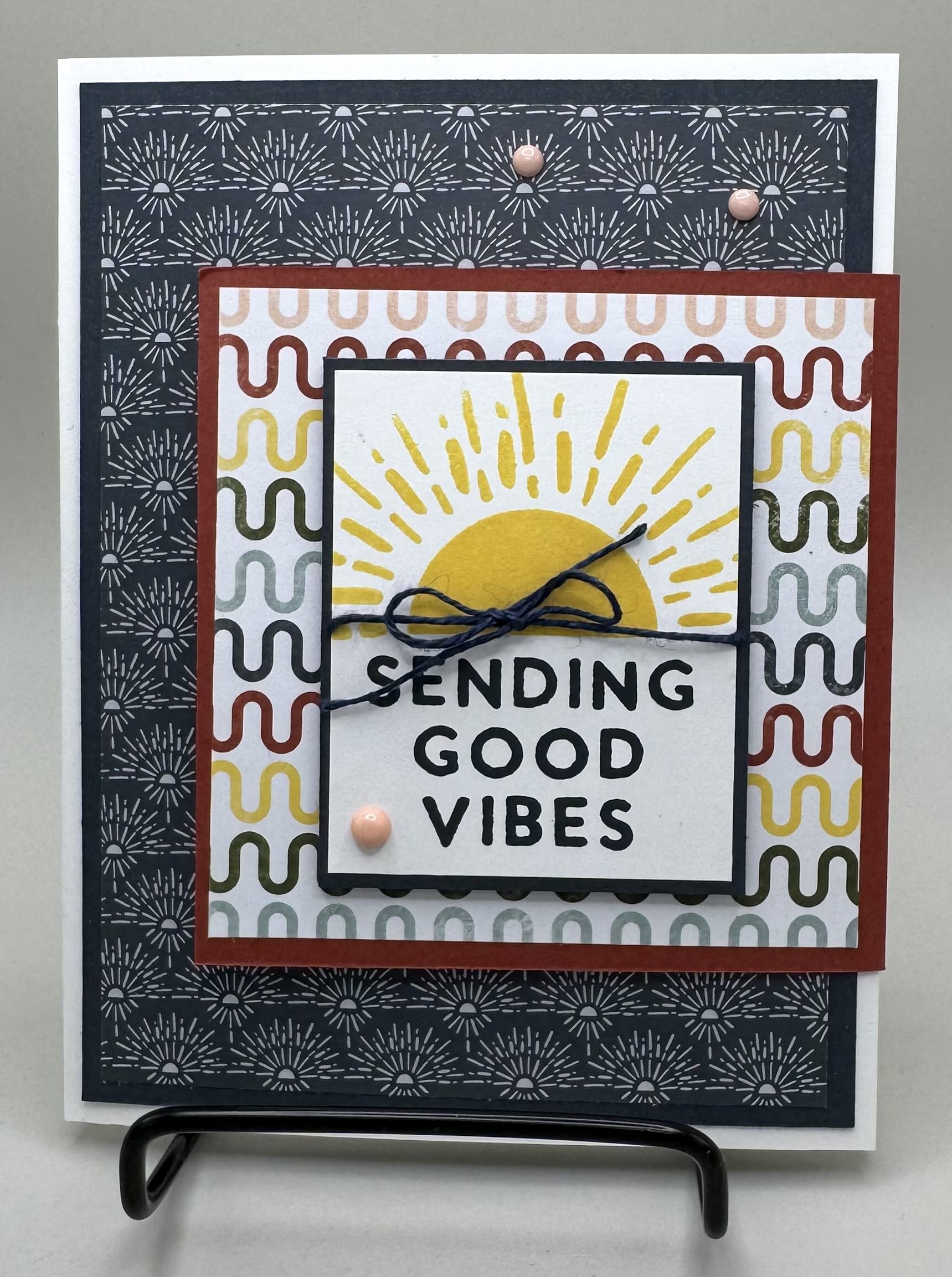
I created this card on a base of Basic White. I don’t do that very often, but it looks nice against dark DSP. I added a layer of Secret Sea to really make that DSP pop. The smaller card is created with Cajun Craze cardstock. I stamped in Daffodil Delight and Secret Sea. I love the coordinating dies in this suite. The rainbows are so cute and there are several ways to die cut them. For this card, I created all the funky fun arches using Cloud Cover, Mossy Meadow, Daffodil Delight, Cajun Craze and Secret Sea cardstock. Everything is cute and perfectly coordinated. I kept the inside simple by just adding a cute Daffodil Delight sun. Here’s what you need to know to create this card.
CUTTING/SCORING MEASUREMENTS
BASE: (Basic White) 10″x5 1/2″, score at 4 1/4″ and 8 1/2″, (Secret Sea 4″x5 1/4″ (x2) and 1 1/4″x5 1/4″, (DSP) 3 3/4″x5″ and 1″x5″, (Basic White) 3 3/4″x5″
SMALL CARD: (Cajun Craze) 7″x3 1/2″, score at 3 1/2″, (DSP) 3 1/4″x3 1/4″, (Basic White) 3 1/4″x3 1/4″
FRONT TAG: (Secret Sea) 2 1/8″x2 5/8″, (Basic White) 2″x2 1/2″
EMBELLISHMENTS: Blue twine, Muted Palette Dots, Dimensionals


I’ve been wanting to try out my new Painted Stripes Stamp and it certainly did not disappoint with this card. I stamped the front layers in Azure Afternoon. It pairs so nicely with the Gallery Blooms Stamps. I made the base Azure Afternoon – a pretty color I just don’t use often enough. I think the reason is that it does not show up much in the current DSP selections. It looks pretty next to Berry Burst though, so that’s what I paired it with in the card layers. I embossed the white panel on the front with the Damask Designs Embossing Folder that coordinates with the Beautiful Gallery Suite Collection. I used my Stampin’ Blends to color the stamped/die cut flower – Granny Apple Green and Berry Burst. I added a simple flower stamped in Tuxedo Black on the small card and then added one more flower to the inside and added the sentiments from the Beautiful Motifs Stamps and used my Stampin’ Blends to color them in the same colors as I used on the front. Don’t forget to add a bow and some Rhinestones to complete this card. So pretty!!


This card came out better than I imagined and I will be making several more! I struggle with having enough masculine cards. I made this card for my son. It’s simple but perfect! The base is Pretty Peacock and Lost Lagoon – two colors that look lovely together. I stamped in Pretty Peacock right on a light shade of DSP from he Woven Textures 12×12 paper pack. It’s a nice change from using Basic White and looks really nice. I used some wood tone paper on the front of the card – from the Country Woods 12×12 paper pack. I’m so happy this paper carried over because it’s so useful. Don’t you. just love that wood frame I die cut from the coordinating dies? I finished the card of with some retired Pretty Peacock ribbon and some Pressed Flower Motifs.
Now I just need to go find a post office to mail this card. That’s one thing about traveling full time….gotta find a place to mail everything. Gone are the days where you walk outside and pop your mail in your mailbox. RVLIFE!
Have a fabulous week!! Happy Crafting.