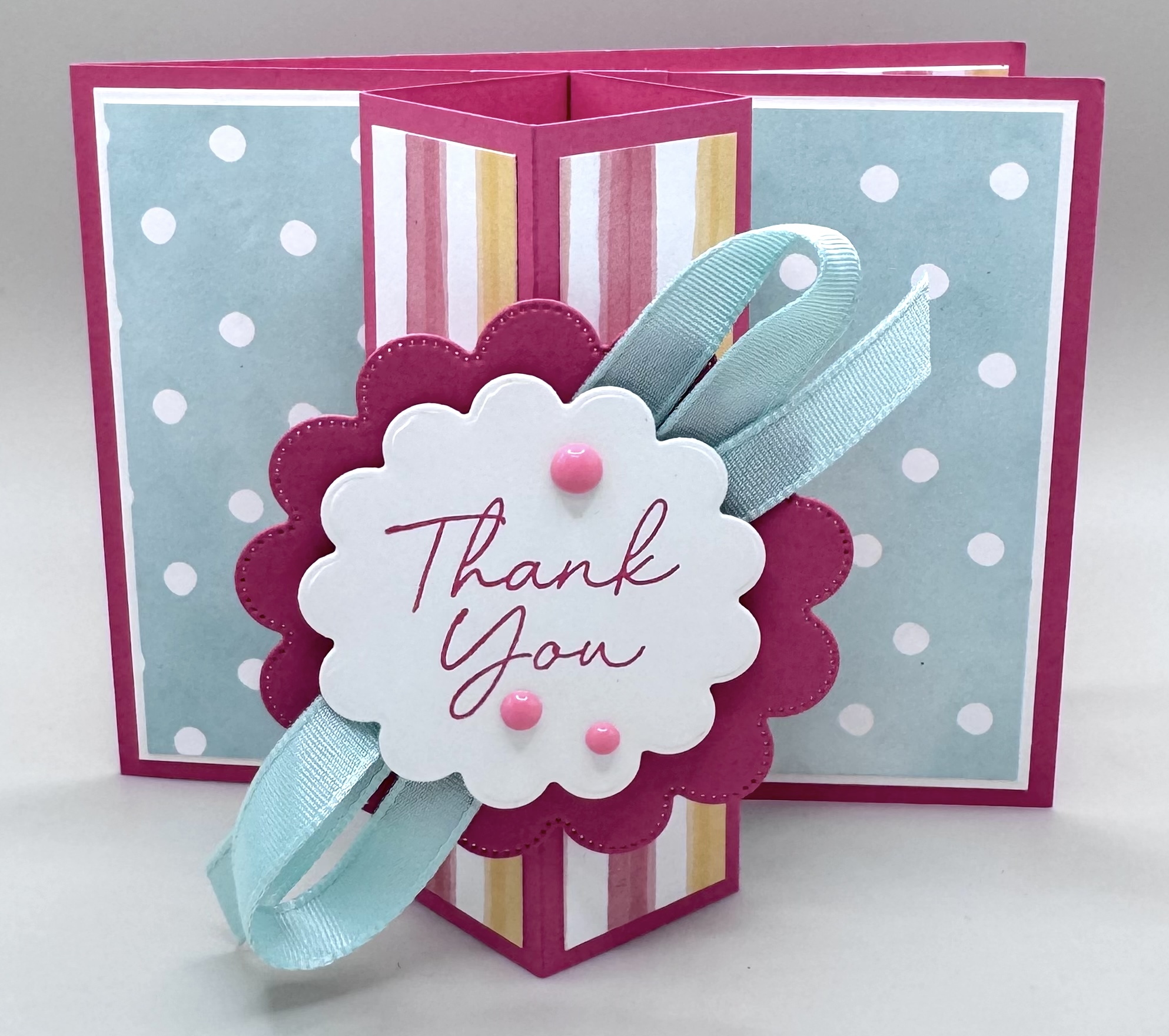
If you’ve been loving pop-out fun folds lately, you’re going to adore this one! Today I’m sharing a fabulous Pop-Up Tower Fun Fold that adds a playful surprise right to the front of your card. The tower pops up beautifully, giving you the perfect space to showcase a greeting, focal point, and fun embellishments.
One of the best things about this design is how customizable it is. You can keep it clean and simple or really dress it up with extra layers, ribbon, and embellishments. The possibilities are endless!


This first card is such a pretty, cheerful design—and totally my style! I used the Beautiful Ordinary Life 12” x 12” Designer Series Paper for a fun mix of color and pattern. There’s just something about combining stripes and polka dots that makes me smile.
The card base features Strawberry Slush and Basic White, with layered elements from the Scalloped Blooms Bundle. Those scalloped dies are incredibly versatile and add such a sweet touch. I tucked a bit of Pool Party ribbon between the layers for extra dimension and finished it off with pink Array of Dots embellishments.
This one is heading to one of my sweet customers—thanks, Debra! I hope she loves it as much as I do.
CUTTING/SCORING MEASUREMENTS
BASE: (Strawberry Slush) 4 1/4″x11″, score at 5 1/2″
LAYERS: (Basic White) 2 1/2″x4″ (x2); (DSP) 2 3/8″x3 7/8″ (x2)
INSIDE LAYERS: (Basic White) 4″x5 1/4″; (DSP) 1″x4″
POP UP TOWER: (Strawberry Slush) 4 1/4″x6″, score at 1/2″, 1 3/4″, 3″, 4 1/4″, and 5 1/2″
LAYERS FOR TOWER: (DSP) 1″x4: (x4)
TABS FOR FRONT ELEMENT: (Strawberry Slush) 1/2″x1 1/2″, score at 3/4″ (x2)
EXTRAS: Array of Dots, Pool Party Ribbon, Dimensionals


Next up is a card made with the stunning Scenic Coast Suite Collection, which I just received before heading out of town. The 6” x 6” Designer Series Paper in this suite is absolutely gorgeous, with vivid colors and iridescent details that shift beautifully in the light.
For this card, I used a Blueberry Bushel base layered with Balmy Blue and Basic White. I created a sturdy focal point by layering Designer Series Paper with cardstock using circles from the Stylish Shapes Dies. While DSP alone works fine, this added layer gives the circle a bit more structure.
The lighthouse and seagulls were die-cut in Secret Sea, and I added a soft glow behind the lighthouse using creamy vellum—just adhered and fussy cut for a subtle effect. I also carried the design into the inside of the card with coordinating paper and a sailboat element.
Quick tip: In my video, I mention adhering the mechanism tabs before adding layers… well, I forgot on this one! You can see the tabs slightly from the side. It still works, but hiding them under your layers definitely gives a cleaner finish.


And finally—my favorite of the bunch! This card features the Waterside Retreat Suite Collection and has the perfect lakeside vibe. I created this as a Father’s Day card for my son-in-law, who loves to fish.
The base is Misty Moonlight, layered with rich, rustic Designer Series Paper. The plaid pattern adds such a cozy, outdoorsy feel. I embellished the front with a tag, some twine, and a Loose Anchor Trinket from the suite for the perfect finishing touch.
I can’t wait to give this one to him!
Which one is your favorite? I’d love to hear! I hope this inspires you to give the Pop-Up Tower Fun Fold a try—it’s such a fun and impressive design.
Happy Crafting!!